In partial apology for the lack of artwork thus far, I bring you a map of the Associated Worlds, constellation by constellation!
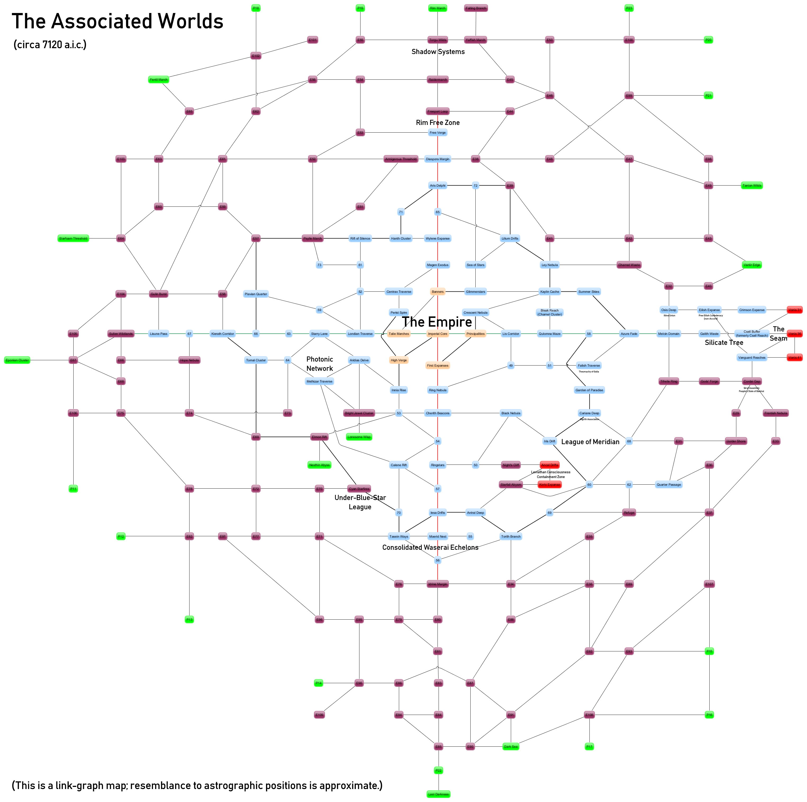
(Click through for the full version. Caution: it’s a big image, 3049 x 3030.)
Key-wise, gold constellations represent the Imperial Core and Fringe, blue the mainstream Associated Worlds, purple the Expansion Regions, and green the Periphery. Red constellations represent the off-the-edge-of-the-map places, namely the Leviathan Consciousness and the connected constellations of the Voniensa Republic. Thin lines are interconstellation stargate connections; thick lines are special high-capacity arterials.
The major connected sets of those are the Worlds’ major trade routes: in green, the Lethíäza Trade Spine; in red, the Mercantile Corridor; and a rough circle in black at the edge of the major Worlds, except where it shares a link with the Spine between “58” and the Azure Fade, the Circumferential, or Golden Band.
I’ve annotated the approximate locations of the major powers, and also (in small text) of a few minor powers that have been mentioned and about which there might be curiosity.
(Oh, and when it comes to those constellations currently numbered – the aforementioned “58”, “E76”, and “P13”, et. al.? Apart from a couple of potential spoilers, that’s my innovation space/creative breathing room. Pay no attention to the Doylist explanation behind the curtain.)
I guess this is something that would be easy to mistake, but this graph looks a little more planar than I’d be expecting, given the likely thickness of the galaxy here. I’ll freely admit my ability to mentally visualise 3d projections of 2d graphs (especially without any distance information) is fairly limited. I can see there being sensible reasons for the connectivity of the inhabited volumes in the galaxy being relatively sparse and planar-ish, at least. Does my brain deceive me here?
Partially (most of the interesting stuff does tend to happen near the galactic plane), but it’s also because it’s a link-graph map which hides the actual spatial relationships. (And to a large extent I have not worried all that much about the actual spatial relationships inasmuch as they only matter to a minority of relativistic vessels almost all of which are pushing out beyond the Periphery anyway.)
Unclear from this style of map, for example, is that both the Lonesome Wisp and Nesthin Abyss constellations are right at the edge of the galactic plane, to acme – even trailing off into the halo – and nadir respectively, and the Bright Jewel Cluster is also pretty far to acme (and is the base for Field Fleet Acme, in fact). Or, to pick a couple of other established examples, it hides that the Ancal Drifts and Koric Expanse are rather more to nadir of the Night’s Cliff and Starfall Abysm than they are to spinward, and that despite their separation on the map, Cyan Starfires is almost directly to nadir of the Ringstars, which encompasses the blue-white giant that the Under-Blue-Star League is named after (but does not include).
Most impressive.
The Silicate Tree are butted hard against the Vonnies? Oh wow, that is likely the worst of the major groups to be neighbours given their utterly incompatible views on digisapiences. I like it. 😀
Yep. Not quite hard against – their territory doesn’t run all the way to the Borderline, being mainly in the Galith Waste and trailing Csell Buffer, but close enough to make things… pleasant.
(And, of course, what the Vonnies would hate to have to admit to themselves is just how many of the Tree’s members are from their side of the border.)
The map labels the Starfoam Threshold as being in the Periphery, but the announcement of the Skymall Exponential Profit’s upcoming visit there describes it as ‘right here in the Expansion Regions’. Were the advertisers just flattering the constellation’s inhabitants, or is the map from an earlier period than the visit?
/me looks shifty
…yeah, let’s go with that first one.